Single Product
Using the Dokan Cloud's page builder you can customize your Single Product page. You will find the necessary widgets to design your single product page to make it look more attractive-

will find this option by clicking on the Customize button from the theme settings.
- Product Title
- Product Description
- Product Image
- Product Price
- Product Rating
- Stock Status
- Add to Cart
- Product Share
- Product Review
- Product Review List
- Related Products
- Tabs (General Block)
- Product Attribute
Let's see how you can use them to design your single product page.
Product Title
A *Product Title* is the name given to a product on an eCommerce website or online catalog. It’s usually one of the first pieces of information that customers see and is essential for conveying the product’s purpose, main features, and unique qualities at a glance.
Drag and drop the Product Title widget into the editor-

In the content section, you can add a link, align the title, and choose the HTML tag-

For styling, you can customize the-
- Color
- Typography
- Text Stroke
- Text Shadow
- Blend Mode

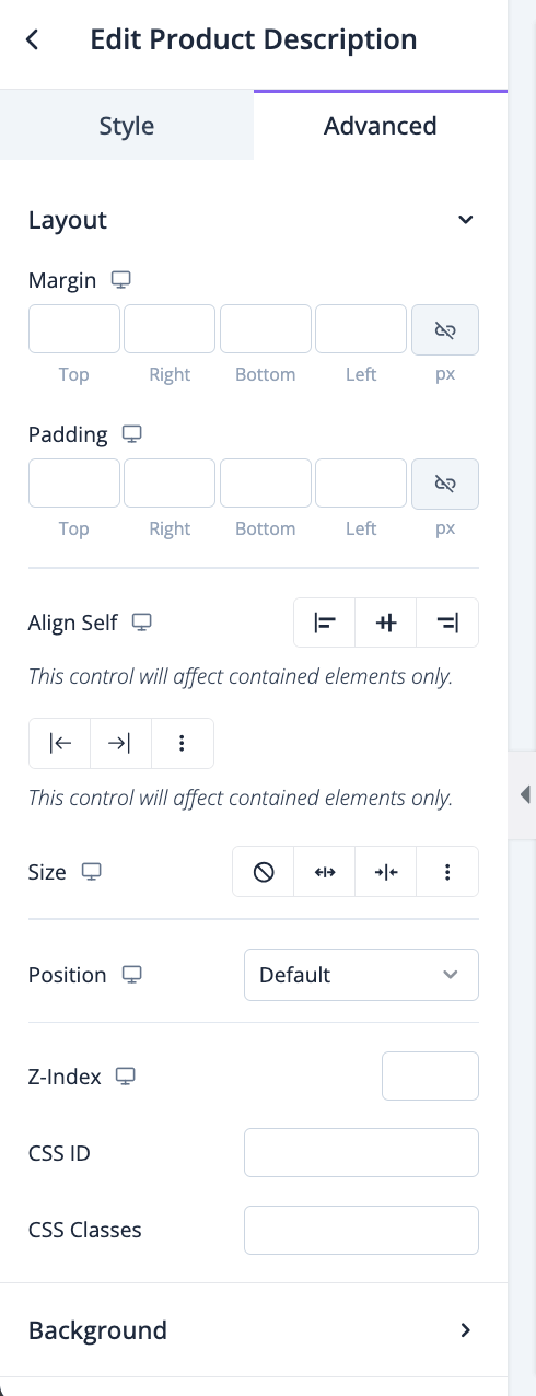
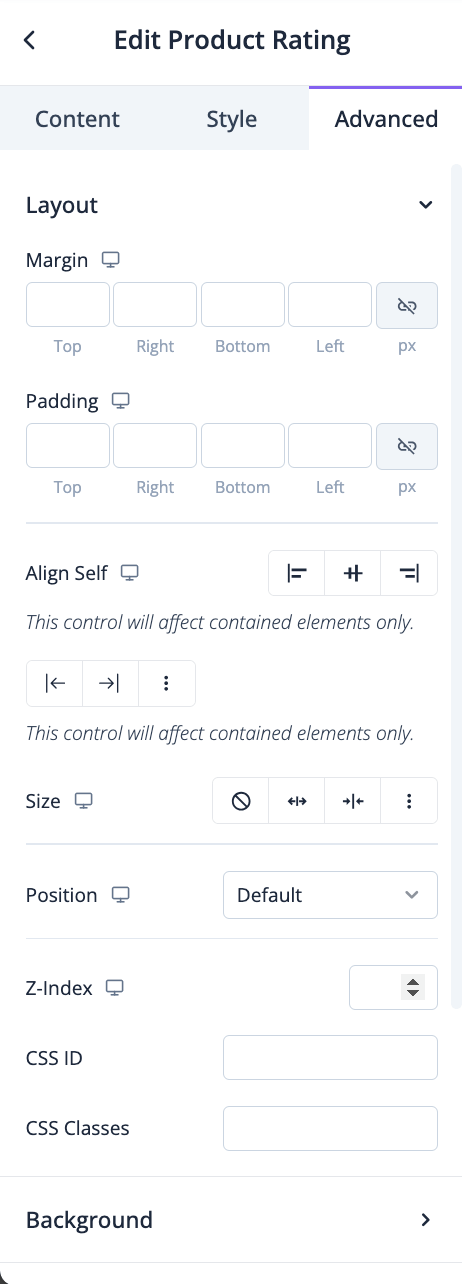
In the advanced section, you can set the padding, margin, alignment, position, customize the Background, attributes, CSS, responsiveness-

Product Description
A *Product Description* is a detailed explanation of a product’s features, benefits, and unique selling points provided on an eCommerce website or online catalog. The product description gives potential buyers essential information they need to make a purchasing decision, helping them understand how the product meets their needs and why it’s worth buying.
Drag and drop the Product Description widget into the editor-

In the style section, you can set the alignment, color, and typography-

In the advanced section, you can set the padding, margin, alignment, position, customize the Background, attributes, CSS, responsiveness-
Product Image
A *Product Image* is a high-quality visual representation of a product displayed on an eCommerce website, online catalog, or marketplace. It’s one of the most influential elements in online shopping, as it helps customers understand the look, feel, and quality of the product without physically interacting with it. Product images play a crucial role in forming first impressions, building trust, and influencing purchase decisions.
Drag and drop the Product Image widget in the editor-
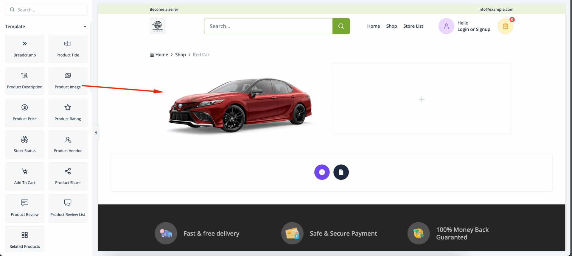
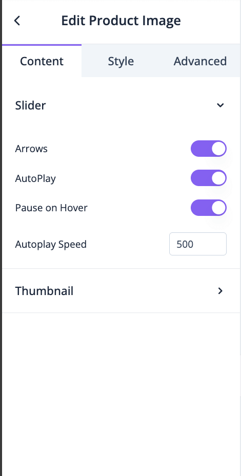
In the general section, you can enable-
- Arrows
- AutoPlay
- Pause on Hover
- Autoplay Speed
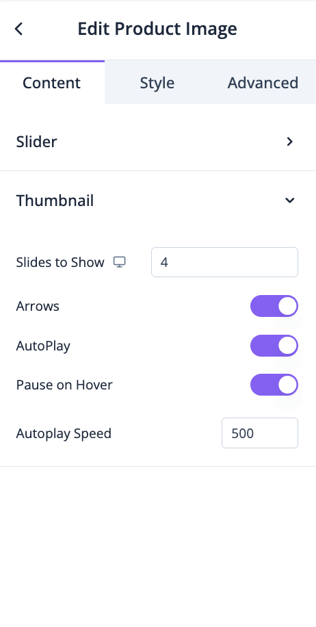
Also, you can set how many slides you want to show, enable-
- Arrows
- AutoPlay
- Pause on Hover
- Autoplay Speed
for thumbnail-
In the Style section, you can select border type, radius, gap, arrows, width, height, color, background color, box-shadow, etc for Slider-
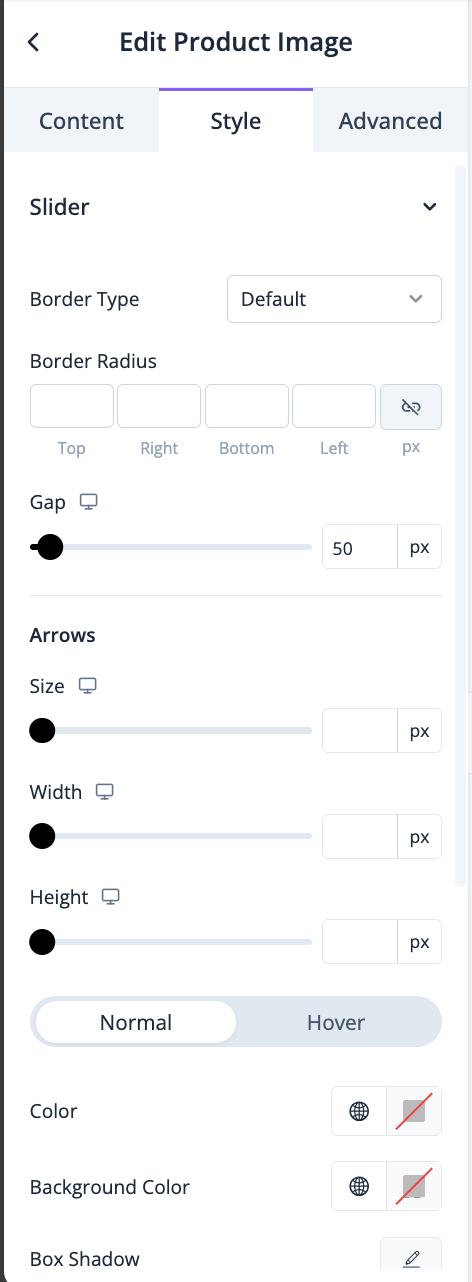
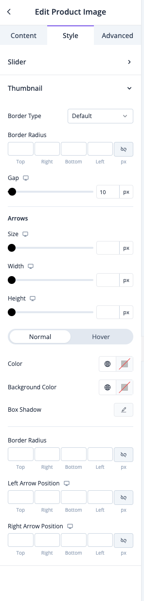
You can also select border type, radius, gap, arrows, width, height, color, background color, box-shadow, etc for Thumbnail-
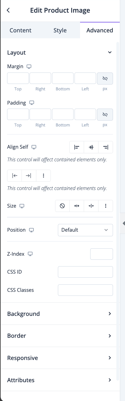
In the advanced section, you can set the padding, margin, alignment, position, customize the Background, attributes, CSS, responsiveness-
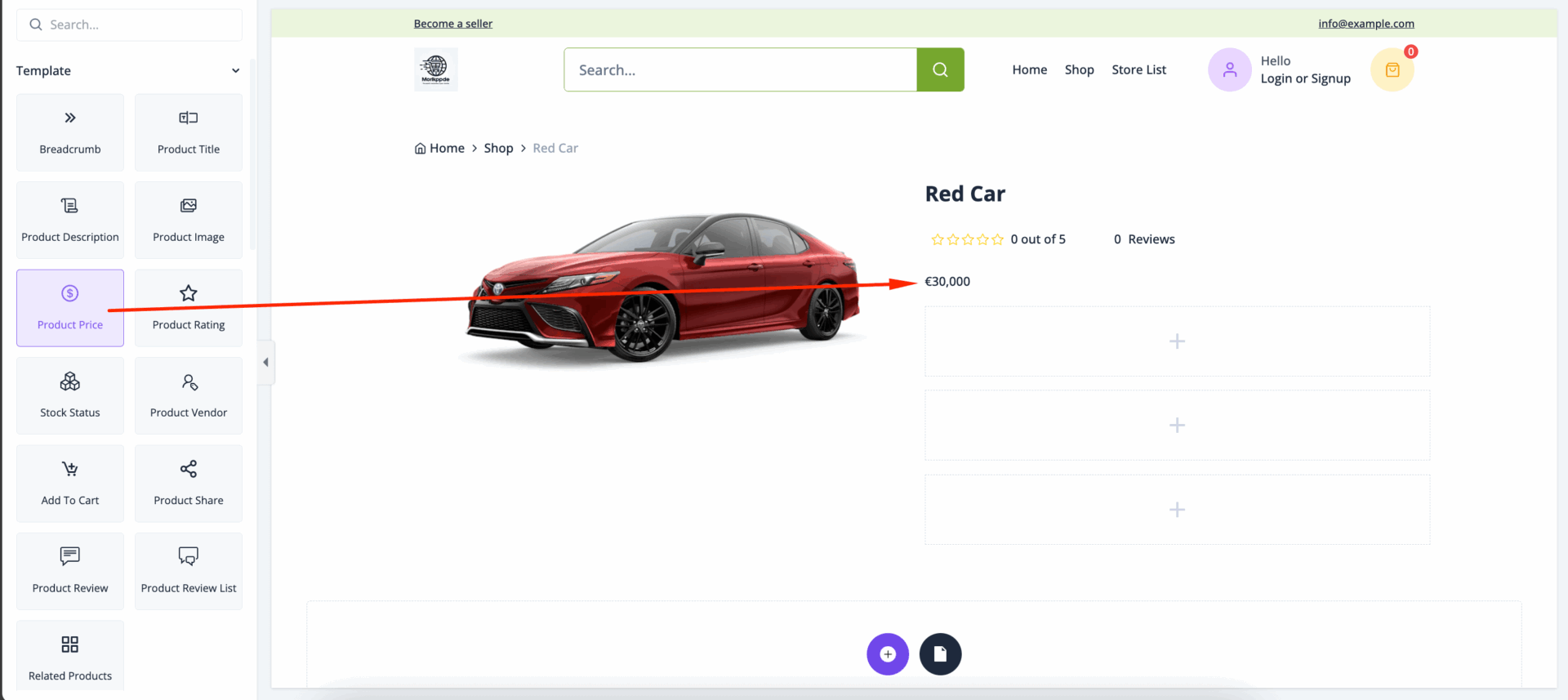
Product Price
A *Product Price* is the amount of money a customer must pay to purchase a product. It’s a critical element in online listings, as it directly impacts customer buying decisions and overall perceptions of value. Pricing can vary based on factors such as the product’s quality, brand, production costs, demand, and competitive positioning.
Drag and drop the Product Price widget to the editor-
In the style section you can control the color, typography, alignment, and spacing of both price and sale price-
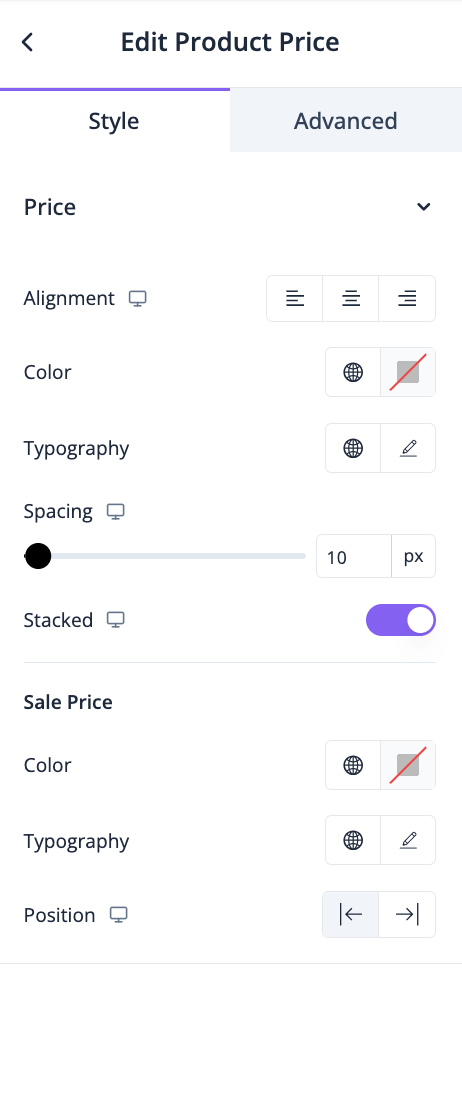
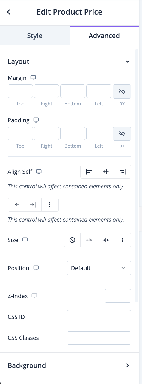
In the advanced section, you can set the padding, margin, alignment, position, customize the Background, attributes, CSS, responsiveness-
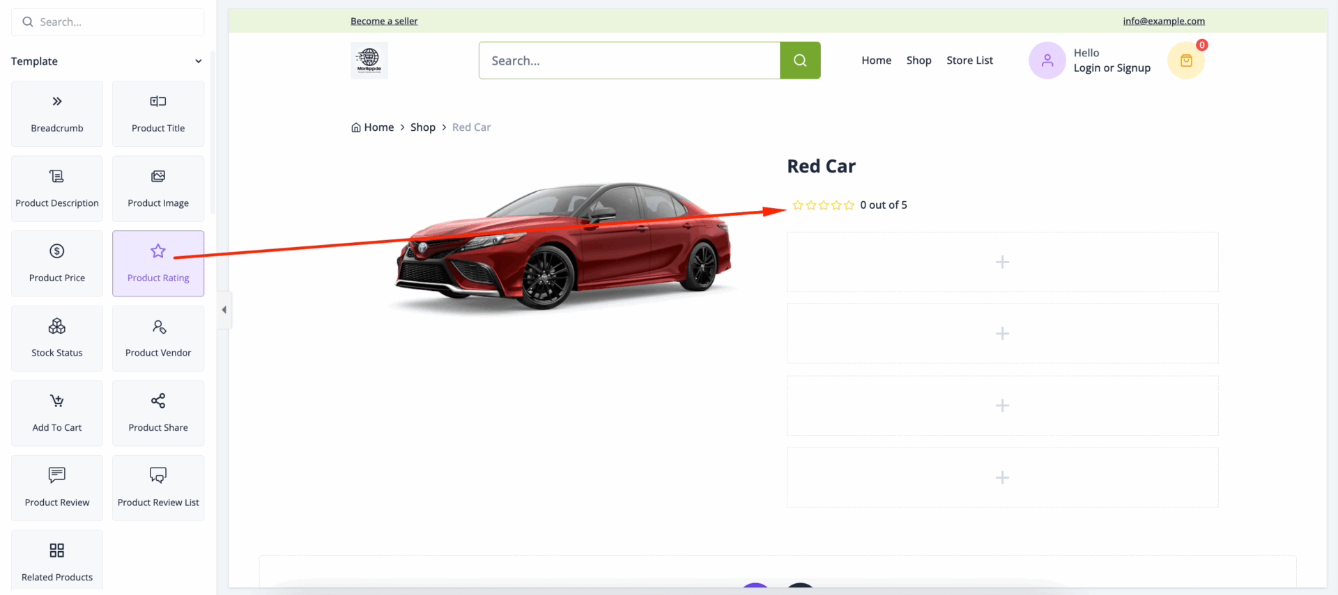
Product Rating
A *Product Rating* is a numerical or star-based score, usually ranging from 1 to 5, reflecting the average customer satisfaction level for a product. Product ratings are often shown alongside reviews on eCommerce platforms, providing prospective buyers with insights into the quality and performance of the item based on previous customer experiences. High ratings can enhance a product’s credibility and appeal, while low ratings might discourage potential buyers.
Drag and drop the Product Rating widget in the editor-
In the content section you can set alignment, enable to show text-
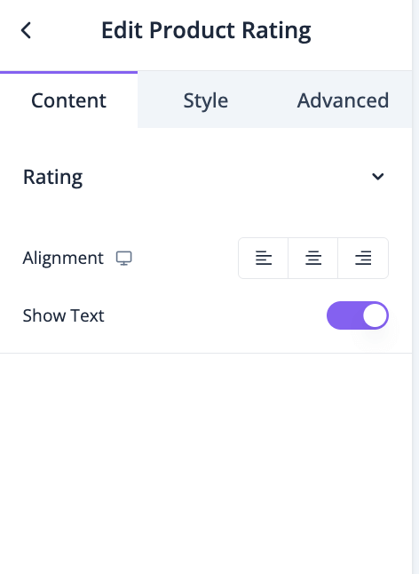
In the style section, you can take care of size, spacing, color and typography-
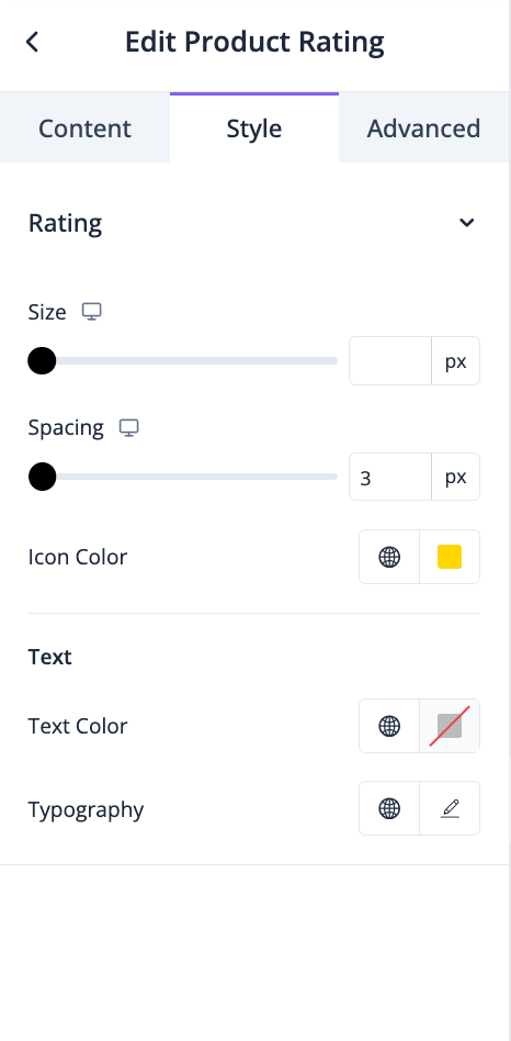
In the advanced section, you can set the padding, margin, alignment, position, customize the Background, attributes, CSS, responsiveness-
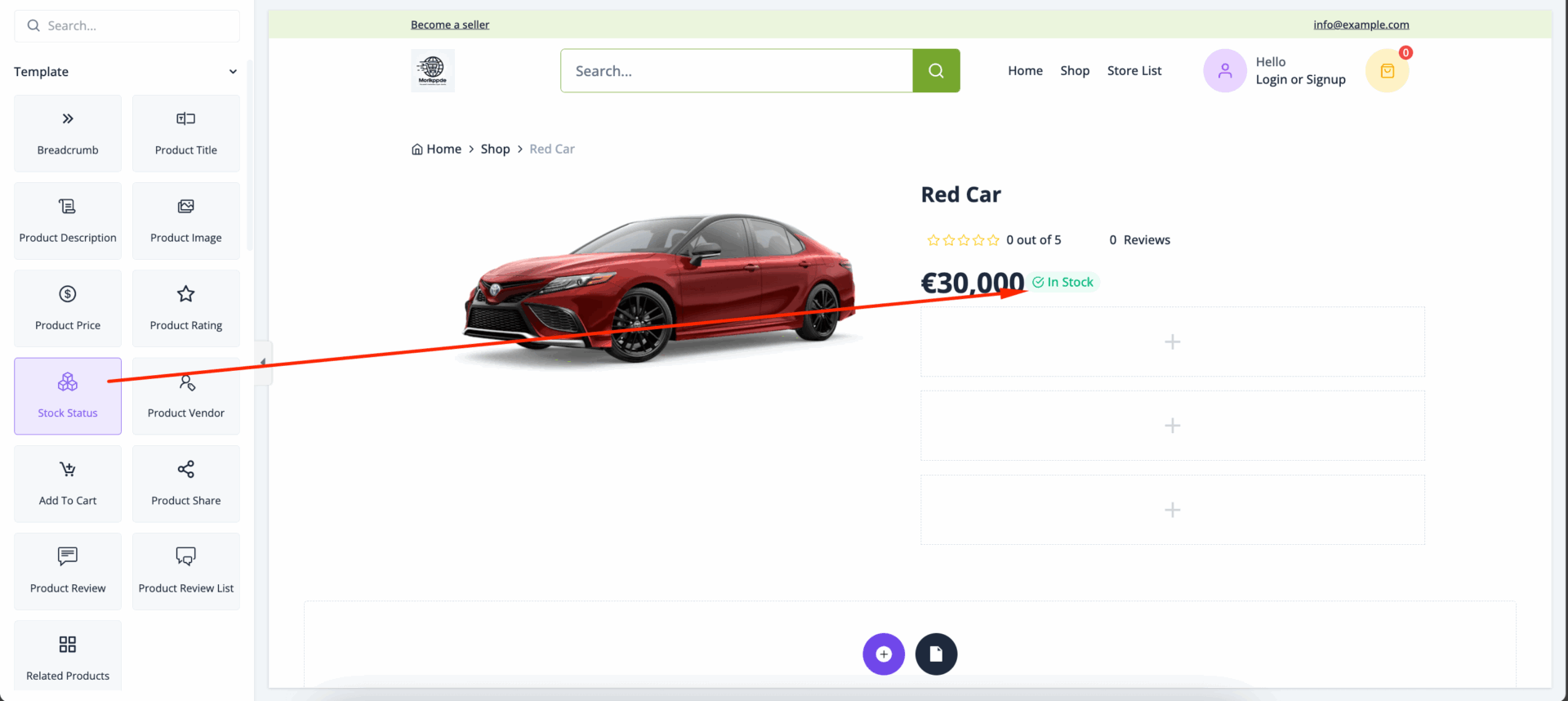
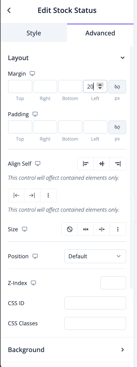
Stock Status
*Stock Status* is an indicator on eCommerce platforms and product pages that shows whether a product is available for purchase. It provides real-time information about inventory levels, helping customers know if a product is in stock, low in stock, or out of stock. Stock status is essential for managing customer expectations, improving the shopping experience, and reducing frustration over unavailable items.
Drag and drop the Stock Status widget to the editor-
In the style section, you can control the alignment, typography, spacing, border radius, margin, padding-
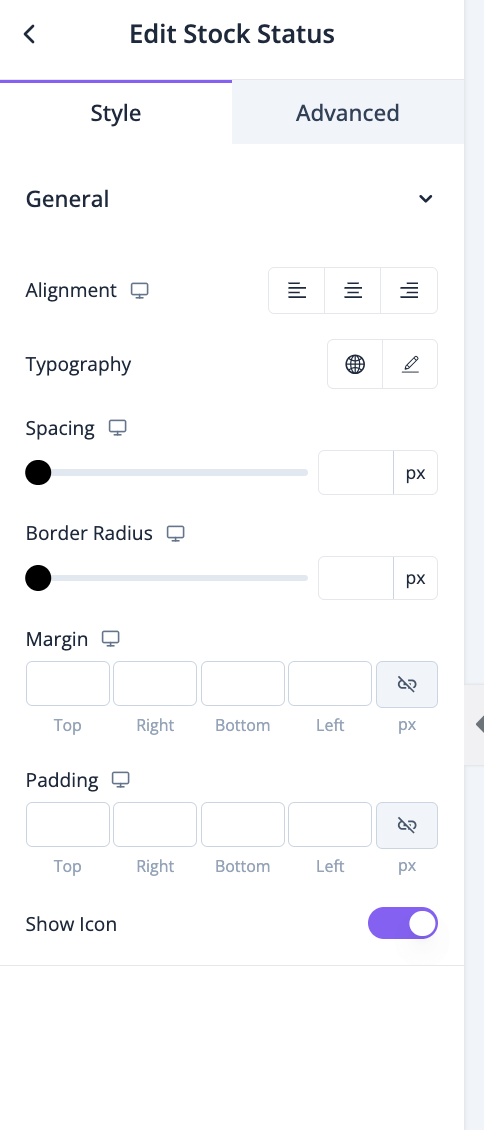
In the advanced section, you can set the padding, margin, alignment, position, customize the Background, attributes, CSS, responsiveness-
Add to Cart
The *Add to Cart* button is a feature on eCommerce platforms that allows customers to select a product for purchase by placing it in a virtual shopping cart. This is a temporary holding area where customers can accumulate multiple items as they continue shopping before proceeding to checkout. The “Add to Cart” function is fundamental to the online shopping experience, enabling a seamless and organized purchasing process.
Drag and drop the Add to Cart widget into the editor-
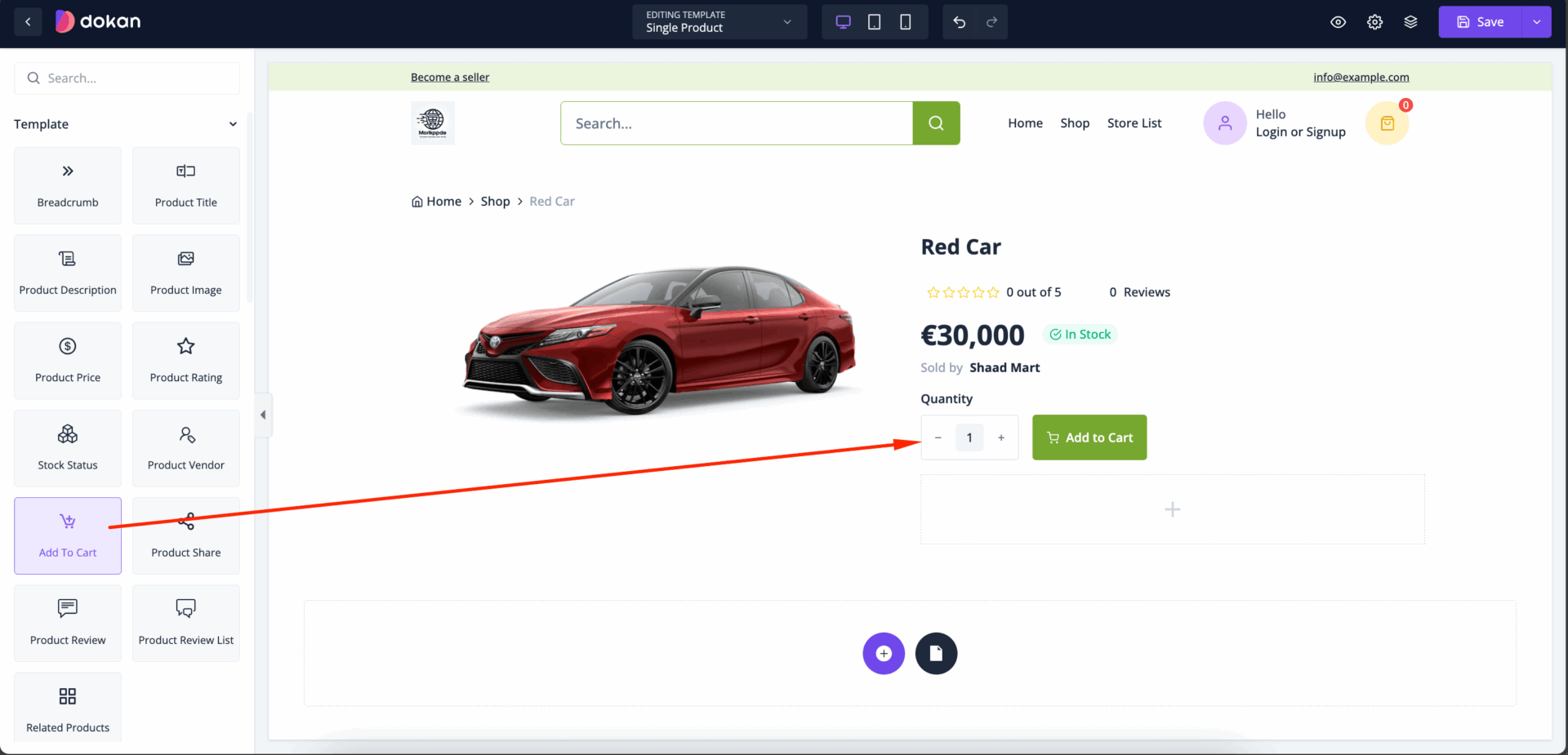
You can control the control the layout, spacing, margin, typography, padding from the style section-
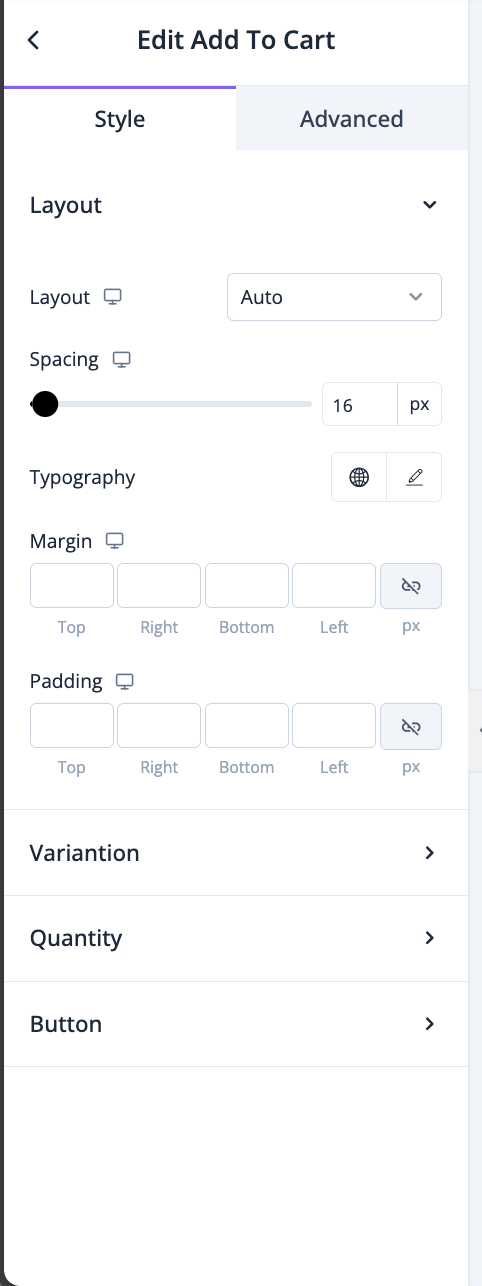
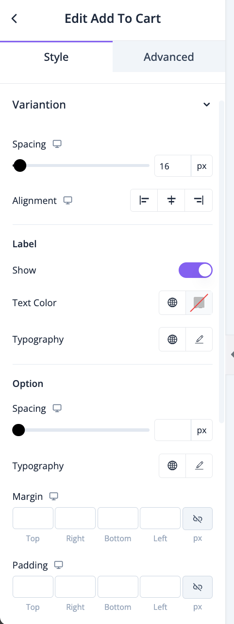
For variation, you will have options for alignment, spacing,typography, margin, padding, border radius, text, background and border color-
Same for quantity, you will have options for alignment, spacing,typography, margin, padding, border radius, text, background and border color-
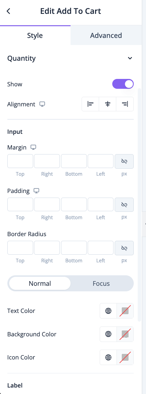
You will have options for alignment, typography, margin, padding, border radius, text, background-color-
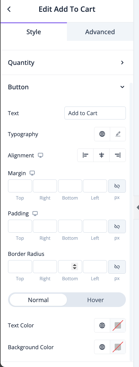
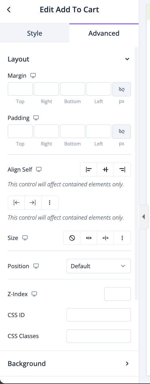
In the advanced section, you can set the padding, margin, alignment, position, customize the Background, attributes, CSS, responsiveness-
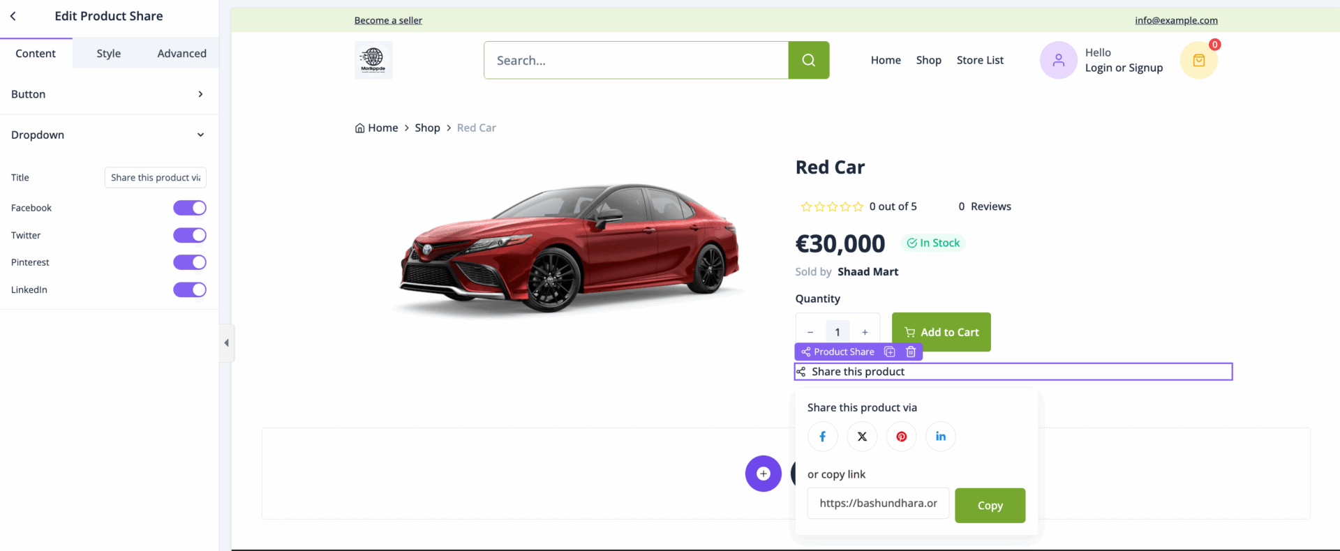
Product Share
*Product Share* is a feature on eCommerce platforms that allows customers to easily share a product they’re interested in on social media, via email, or through direct messaging. This sharing functionality typically appears as a set of icons (e.g., Facebook, Twitter, Pinterest) or a general “Share” button, enabling quick distribution across various networks and apps. Product share is an effective way to leverage social media to increase product visibility and encourage word-of-mouth marketing.
Drag and drop the Product Share widget on the editor-
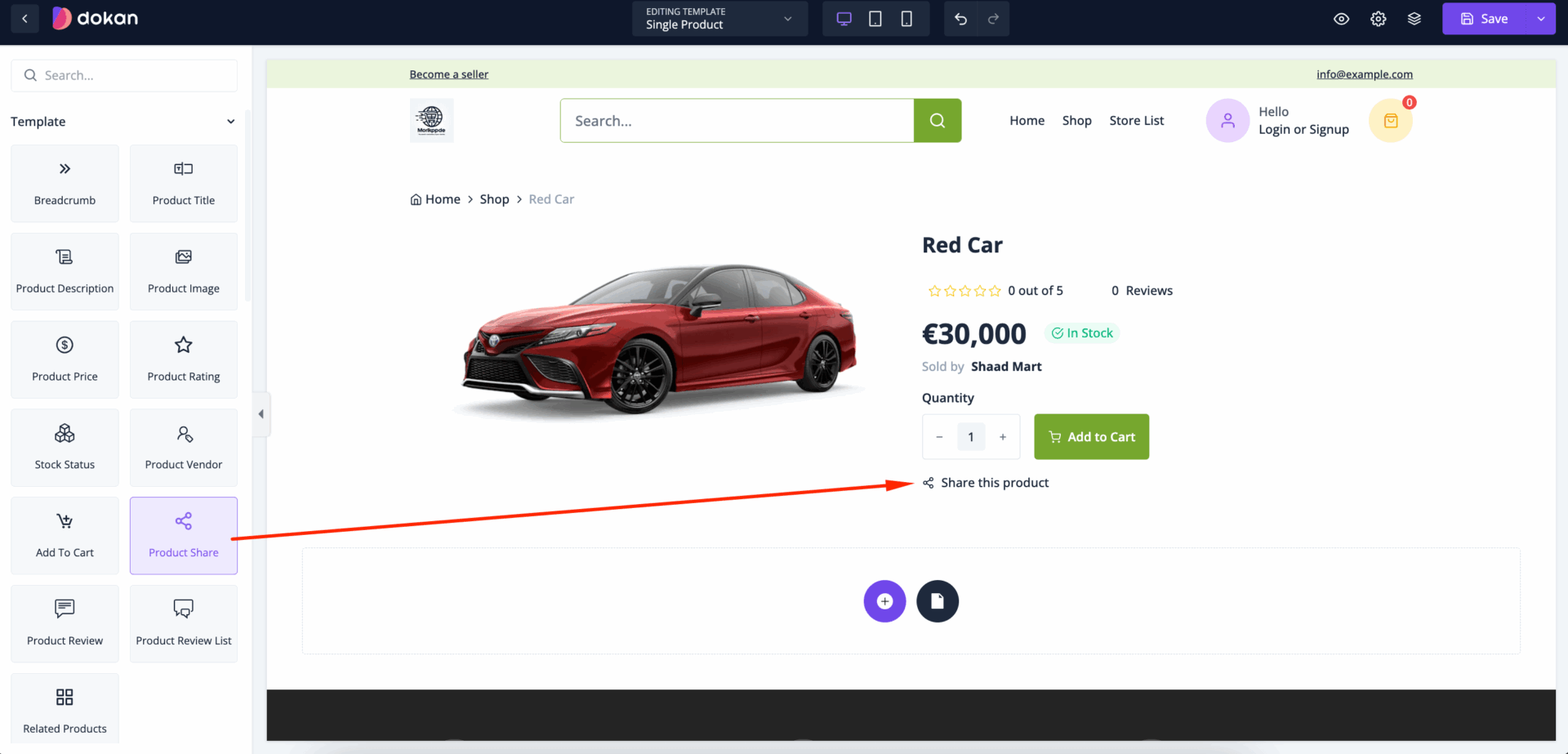
In the content section, you can change the title of the button and set the icon-
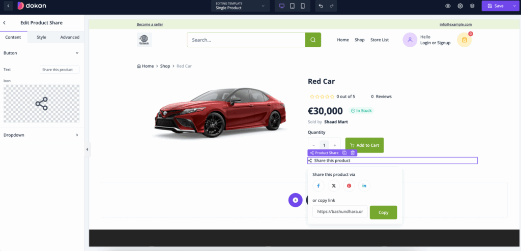
For dropdown, you can set title and you can enable-
In the style section, you can set alignment, spacing, typography, margin, padding, border radius, etc-

You can also control the width, margin, padding, border radius, color, typography, etc-
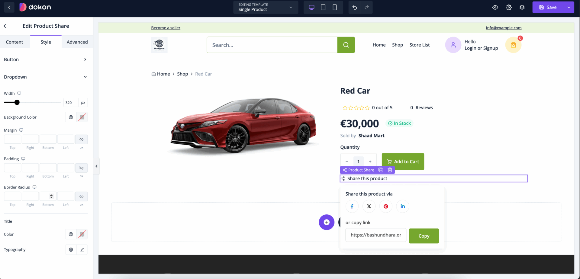
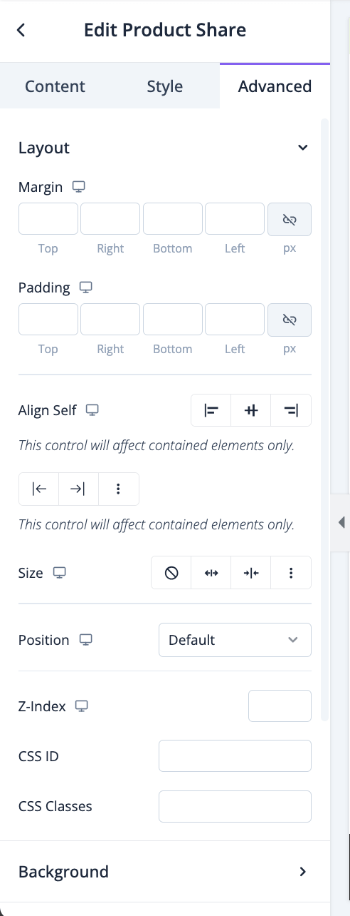
In the advanced section, you can set the padding, margin, alignment, position, customize the Background, attributes, CSS, responsiveness-
Product Review
A *Product Review* is a customer’s written evaluation of a product based on their personal experience with it, often accompanied by a rating (usually out of five stars). Product reviews appear on eCommerce platforms, providing valuable insights for potential buyers. They can include details about product quality, functionality, and how well it meets the customer’s needs, helping others make informed purchasing decisions.
Drag and drop the Product Review widget in the editor-
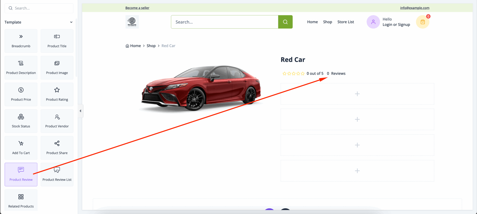
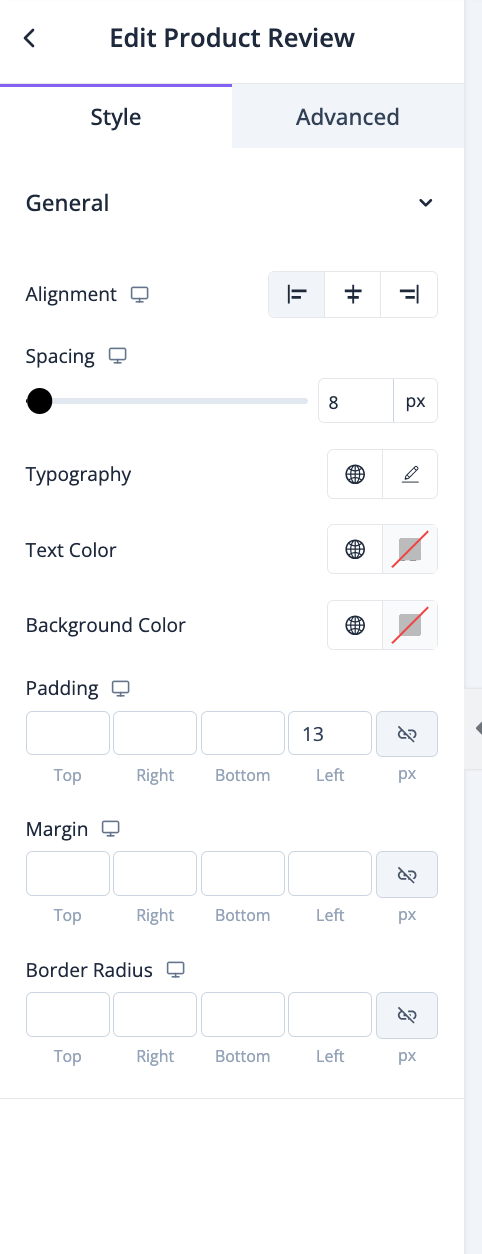
In the style section, you can control alignment, spacing, typography, text color, background color, padding, margin-
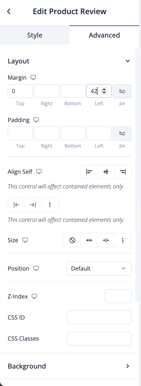
In the advanced section, you can set the padding, margin, alignment, position, customize the Background, attributes, CSS, responsiveness-
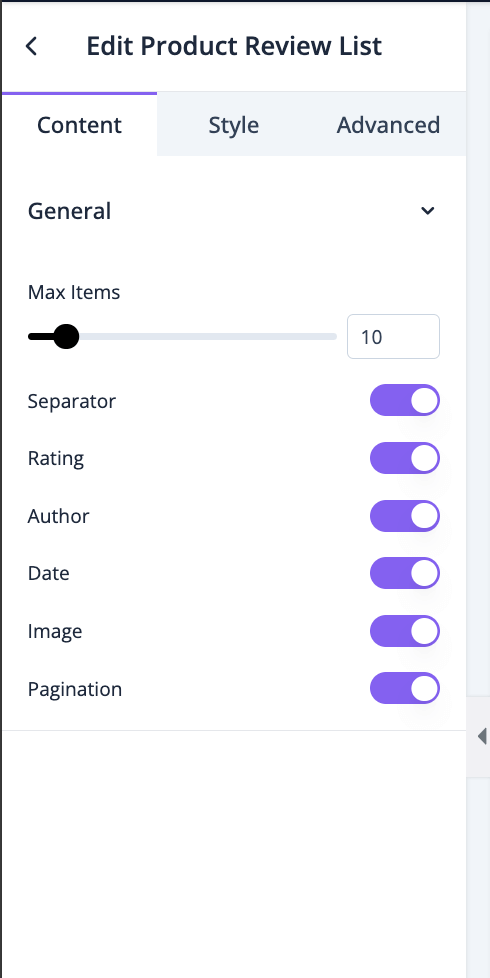
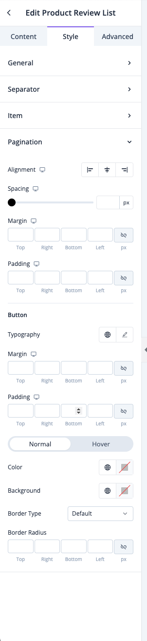
Product Review List
A *Product Review List* is a section on an eCommerce product page that displays all customer reviews for that item. This list organizes individual reviews, usually showing the most recent or most helpful ones at the top. It provides an aggregated look at customer feedback, including overall product satisfaction, detailed comments, and often star ratings, to help potential buyers assess the product’s quality and suitability based on real user experiences.
Drag and drop the Product Review List widget into the editor-
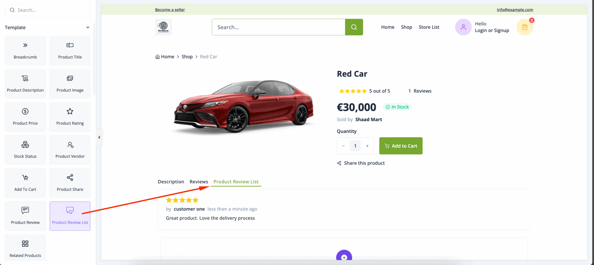
In the content section, you can select how many reviews you want to show, enable-
- Separator
- Rating
- Author
- Date
- Image
- Pagination
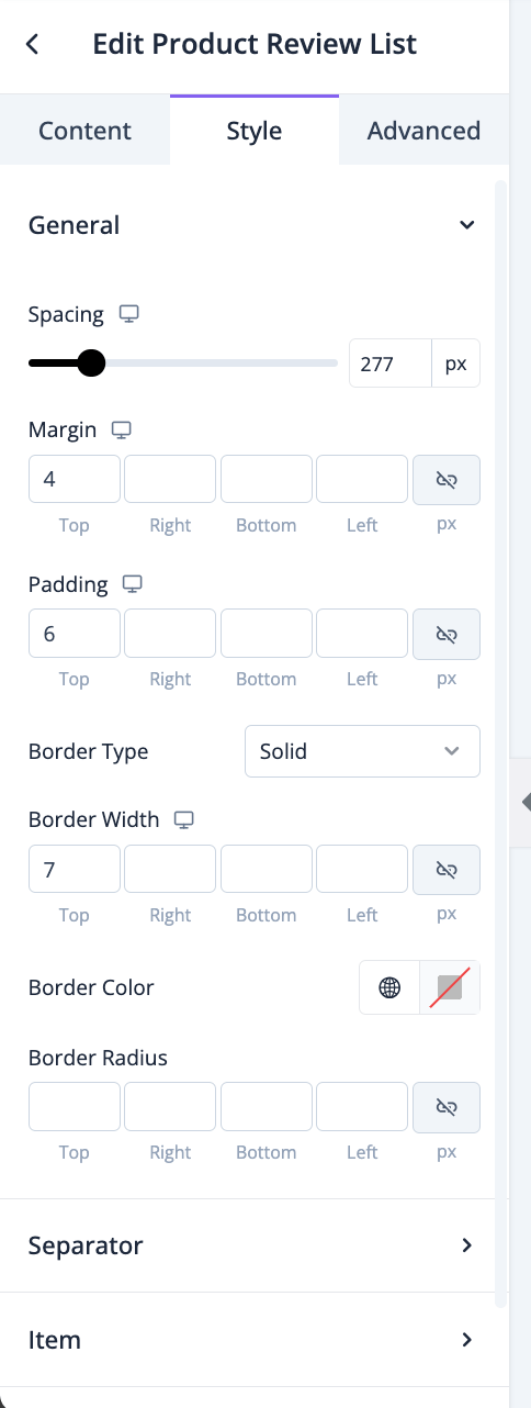
In the style section, you can control spacing, margin, padding, border type, border radius, color, width-
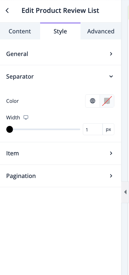
For the separator, you can customize color and width-
For the items, you can control spacing, margin, padding, border type, border radius, color, width-
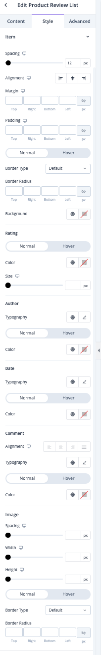
Same for pagination as well-
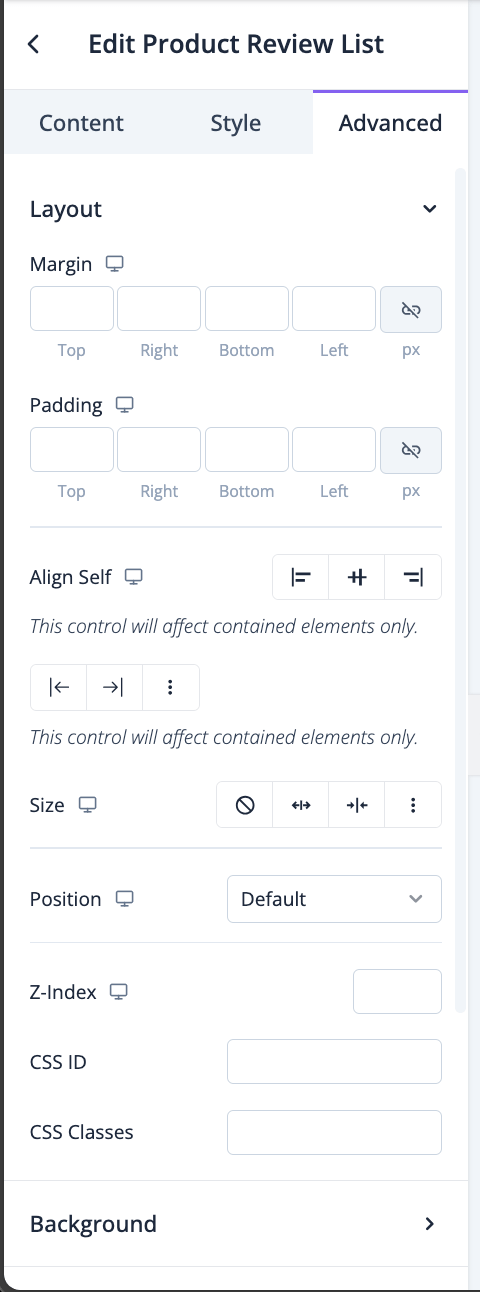
In the advanced section, you can set the padding, margin, alignment, position, customize the Background, attributes, CSS, responsiveness-
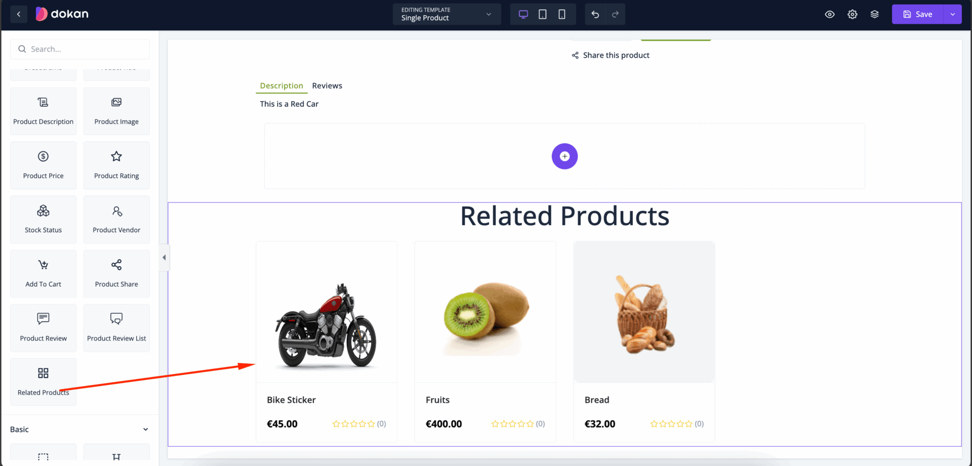
Related Products
*Related Products* are a curated selection of items displayed on a product page to showcase similar or complementary products to what a customer is currently viewing. This feature helps customers discover other items that may meet their needs, leading to higher engagement, increased sales, and improved customer satisfaction. Related products can be displayed based on factors like similar categories, complementary usage, or items frequently bought together.
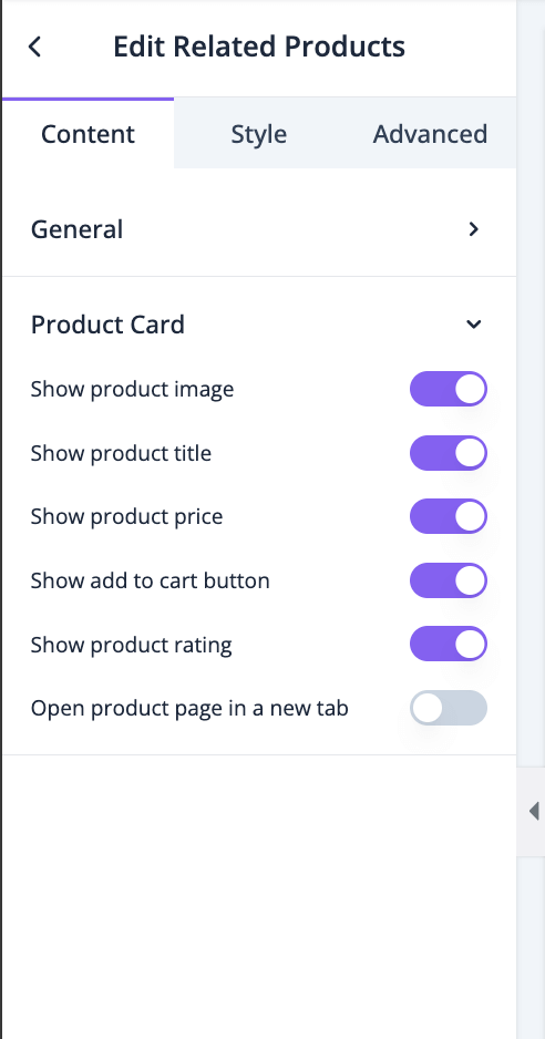
Drag and drop the Related Products widget into the editor-
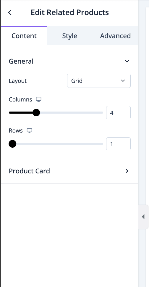
In the content section, you can select layout, columns and rows-
For product card, you can enable-
- Show product image
- Show product title
- Show product price
- Show add to cart button
- Show product rating
- Open product page in a new tab
In the style section, you can set column gap and row gap for the content-
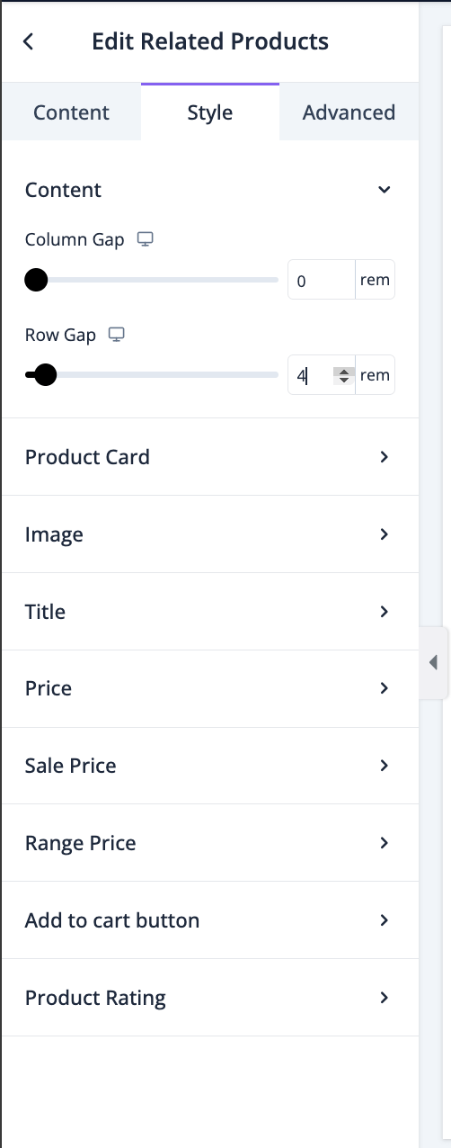
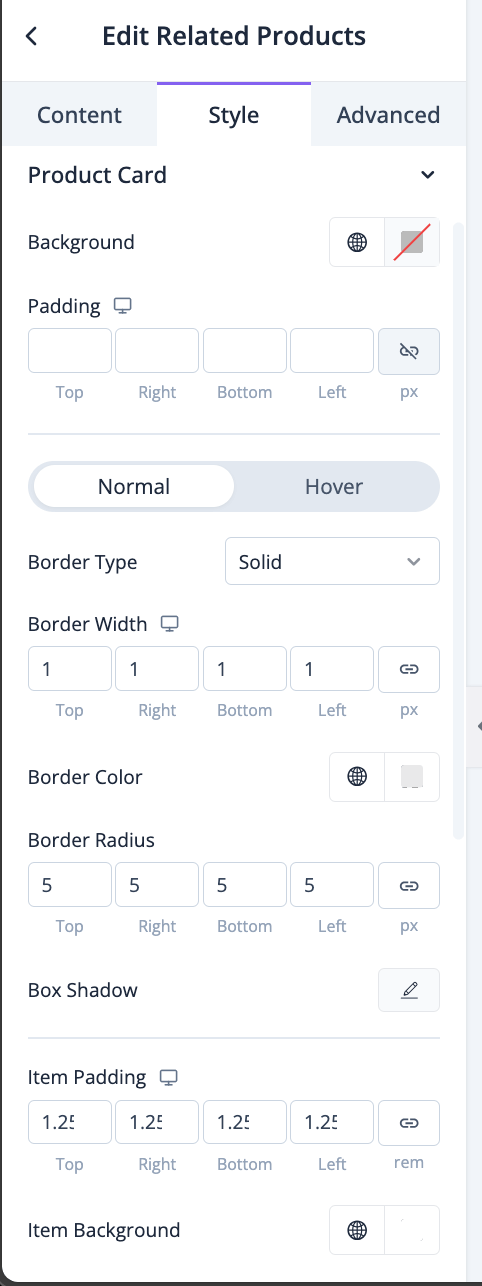
For product cards, you can set the background, padding, border type, radius, width, color, box shadow, item background, item padding-
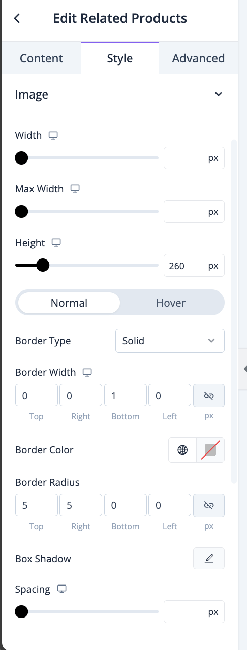
You can set the width, height, border type, border radius, border color, box shadow, spacing for images-
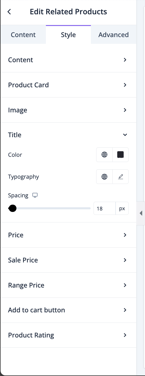
You can set the typography, color, spacing for the title-
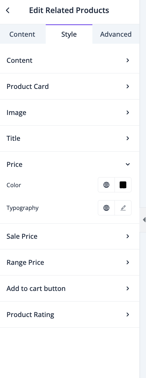
You can set color and typography for prices-
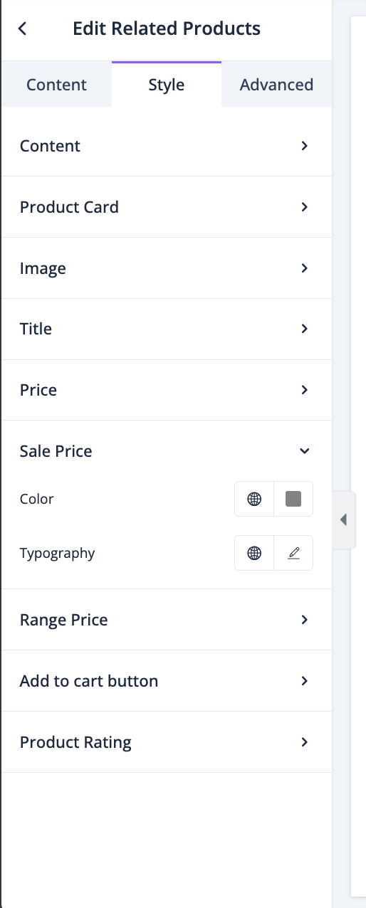
You can set color and typography for Sale Prices-
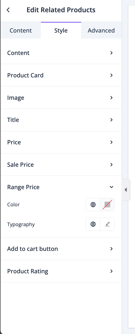
You can set color and typography for Range Prices-
You can set Text and typography for Add to Cart button-
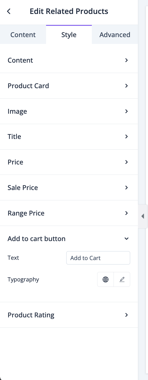
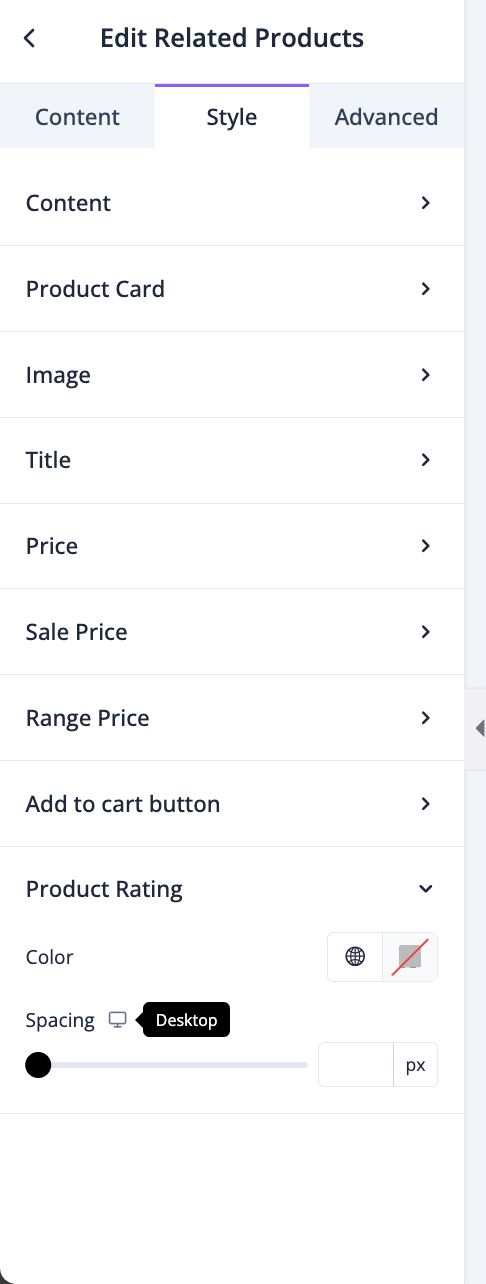
You can set color and spacing for product rating-
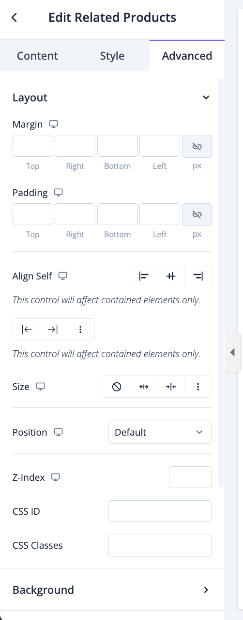
In the advanced section, you can set the padding, margin, alignment, position, customize the Background, attributes, CSS, responsiveness-
Tabs
The Tab widget is not directly connected to any eCommerce feature, but it is a very important widget for designing the single product page.
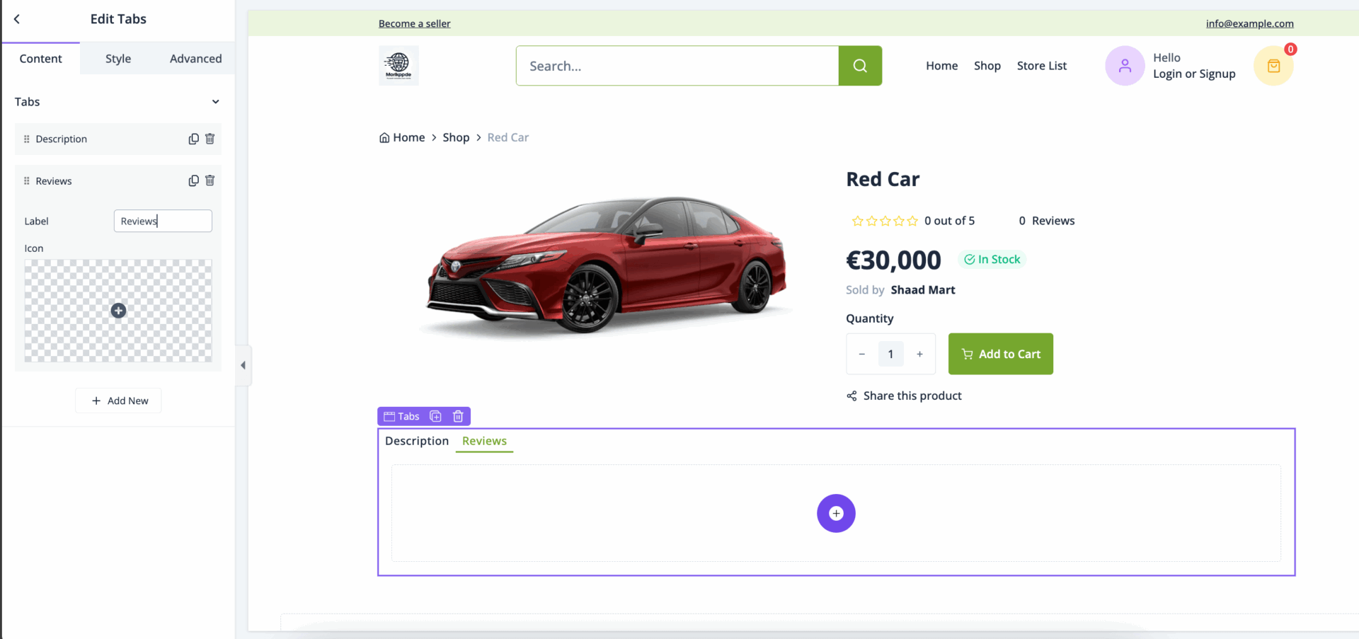
With the Tab widget, you can add various widgets in one section. *If you look at the top of the documentation, you can see we have added the Product Description, Reviews, and Reviews List widget in the same section. That was done using Tabs.*
To use the Tab widget, just drag and drop in the editor-
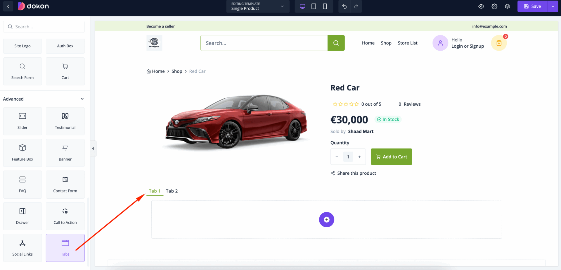
In the content section, you can create new tabs by clicking on the Add New button. You can set Label and icon for each tab-
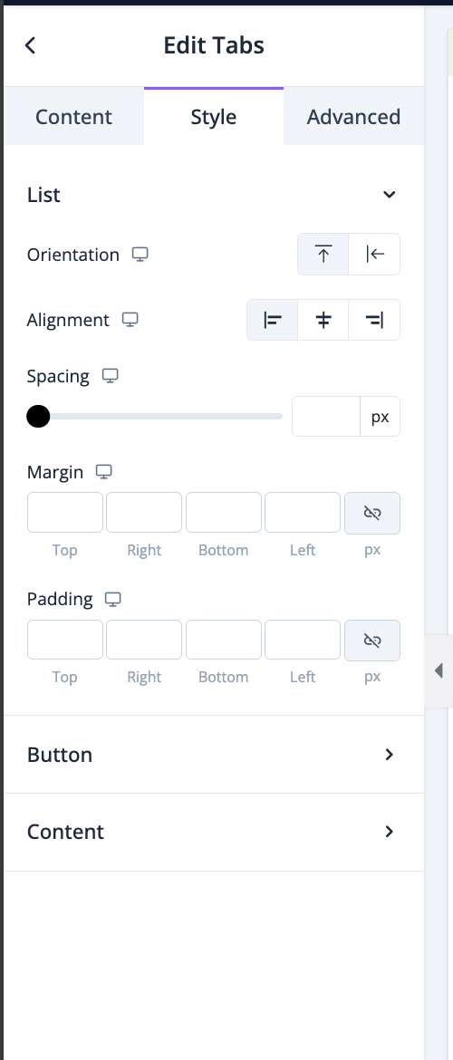
In the style section, you can set if you want to show the tabs horizontally or vertically by setting the orientation, alignment, spacing, margin, padding for List-
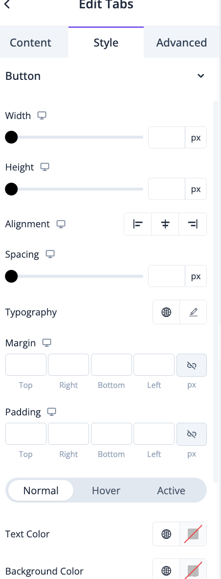
For the button, you can set height, width, alignment, spacing, typography, margin, padding, text color, background color, border radius, etc-
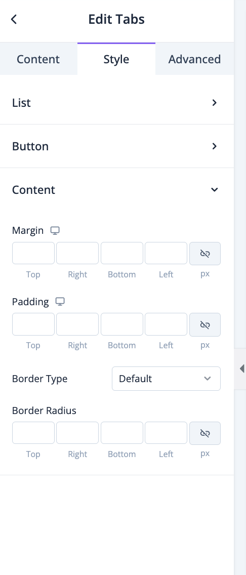
For content, you can set margin, padding, border type, border radius-
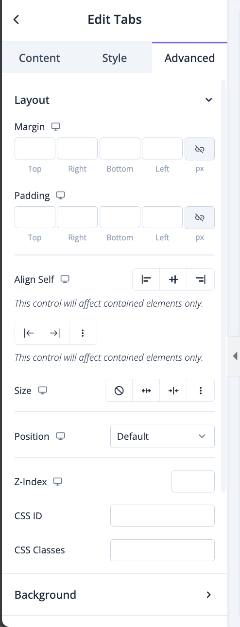
In the advanced section, you can set the padding, margin, alignment, position, customize the Background, attributes, CSS, responsiveness-
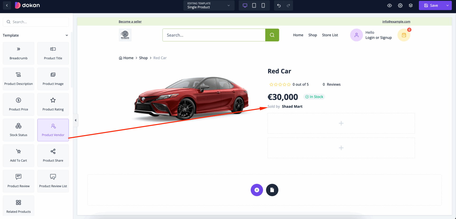
Product Vendor- For Marketplace
If you are using the marketplace version of Dokan Cloud, then you can show the vendor name in the single product page.
On multi-vendor marketplaces like Amazon, Etsy, or platforms using solutions like Dokan, each vendor operates their own store, manages their products, and interacts with customers through the platform. Displaying the product vendor information on a product page helps customers understand who they’re buying from and can include a link to the vendor's store page, showcasing their full catalog of offerings.
Juts drag and drop the Product Vendor widget in the editor-
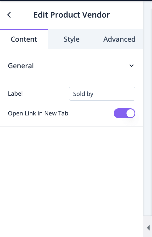
In the content section, you can set the label name and enable open the link in new tab-
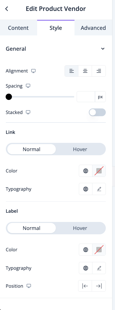
In the style section, you can set the alignment, spacing, color, typography, etc-
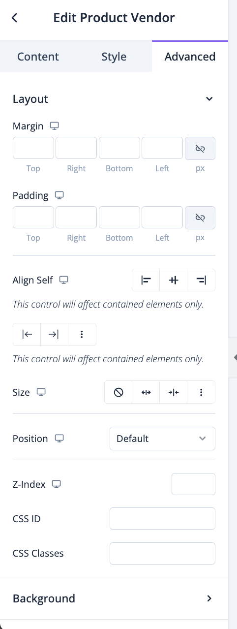
In the advanced section, you can set the padding, margin, alignment, position, customize the Background, attributes, CSS, responsiveness-
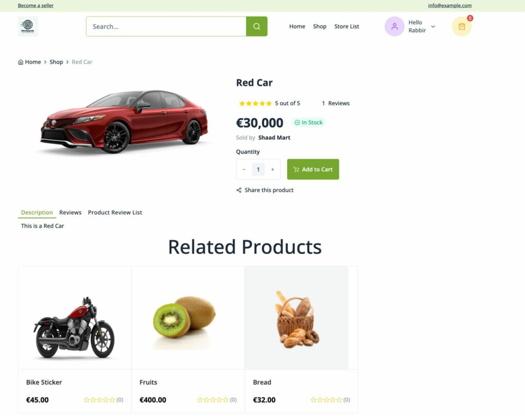
This is what the final preview may look like-
Product Attribute
You can add the product attributes in the single product page using Product Atrribute block. Just drag and drop the Product Attribute block to the editor-

You can customize the block to fit your website design.
In the ContentT section you can select the Layout, enable/disable variations and show how you want to display the separator-

Then, on the Style section, you can fix the alignment, background color, margin, etc-

For the items you can set background color, margin, spacing, height, width-

ou will find many option in the label section as well-

Same goes for value section-

In the advanced section, you can set the padding, margin, alignment, position, customize the Background, attributes, CSS, responsiveness-

his is what the preview will look like-

Последнее изменение: 25/02/2026
Спасибо!